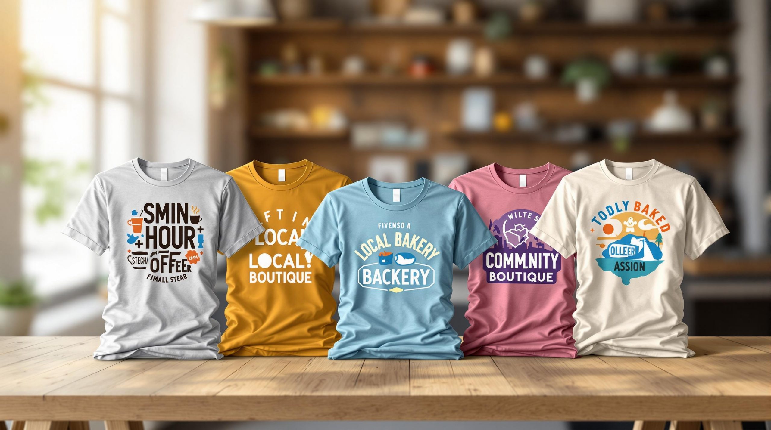
Custom t-shirts are more than just clothing – they’re affordable marketing tools that boost brand visibility and customer loyalty. They generate over 3,400 impressions during their lifespan at just $0.002 per view. Whether you’re looking to grow your revenue or engage your community, here are six impactful t-shirt design strategies:
- Simple Logo Design: Keep it clean with 2-3 colors to enhance brand recognition and reduce printing costs.
- Bold Text and Slogans: Use short, memorable phrases with high-contrast colors for maximum readability.
- Local Community Themes: Incorporate local landmarks or traditions to build stronger customer connections.
- Mascots or Characters: Create a fun, relatable mascot to make your brand more memorable.
- Retro or Vintage Styles: Tap into nostalgia with retro fonts, patterns, and colors that resonate with younger audiences.
- Patterns and Brand Colors: Use consistent brand colors and patterns to create eye-catching but cohesive designs.
These strategies help turn customers into walking ambassadors for your brand while keeping designs cost-effective and impactful. Let’s dive into the details.
Related video from YouTube
1. Simple Logo Design
A well-thought-out, simple logo design on your business t-shirts can leave a strong impression without costing a fortune. Research from the University of Loyola shows that using color in simple logos can boost brand recognition by up to 80%, making them highly effective for small business marketing.
Take MasterCard‘s 2019 redesign as an example. They dropped the text and kept only the iconic red and yellow circles, which increased their brand recognition from 81% to 95%. This same approach works for smaller businesses too. Sticking to a 2-3 color palette not only enhances brand visibility but also helps reduce printing expenses.
Here are three key tips for t-shirt logos:
- Color Strategy: Use no more than 2-3 colors. This keeps costs down and ensures your logo stands out.
- Placement and Scale: Place your logo in high-impact spots like the center chest or left breast. Make sure it’s visible from 10-15 feet away and still clear when scaled down.
Key Elements for Effective Logo Design
| Element | Focus | Why It Matters |
|---|---|---|
| Typography | Clean, easy-to-read fonts | Ensures your logo is legible at a glance |
| Contrast | Strong contrast in design | Helps your logo pop on different shirt colors |
| Negative Space | Thoughtful blank space use | Makes your design more memorable |
| Icon/Symbol | Single recognizable shape | Boosts instant brand recognition |
Printing Tips: Simple designs often require fewer screens in the printing process, which helps keep production affordable while maintaining a polished, professional look.
Next: How bold text can amplify your message.
2. Bold Text and Slogans
Bold typography and memorable slogans can turn a simple t-shirt into a walking advertisement for your brand. Just like a logo, bold text serves as a quick, visual representation of your identity.
Making an Impact with Typography
Creating effective bold text is all about balancing style and visibility. Here’s how to get it right:
- Keep slogans short – 3 to 5 words for better readability.
- Use sans-serif fonts paired with high-contrast colors.
- Place text strategically, like on the center chest or upper back.
- Ensure the design is legible from 15-20 feet away.
- Stick to a maximum of two font styles to maintain a clean hierarchy.
- Match colors with your brand’s personality:
- Red for energy (great for fitness brands).
- Blue for trust (ideal for service companies).
- Green for eco-friendly or growth-focused businesses.
Typography and Slogan Guidelines
| Element | Guidelines | Why It Matters |
|---|---|---|
| Font Size | Large enough to read from 15-20 feet | Boosts visibility |
| Color Contrast | High contrast between text and shirt | Improves readability |
| Word Count | 3-5 words | Keeps the message clear |
| Font Style | Sans-serif for main text | Enhances legibility |
| Text Placement | Center chest or upper back | Ensures maximum exposure |
Tips to Avoid Common Mistakes
Great t-shirt designs keep the message simple and the text layout clean. Avoid overcrowding your design or using more than two font styles. Always test your design on various shirt colors to ensure it works across the board.
For added creativity, combine text with simple graphics. For example, a bakery could incorporate the slogan “Baked with Love” into a heart shape, while a pizza shop might replace the “O” in their text with a pizza slice.
Next: How local elements build community connections.
3. Local Community Themes
Using local themes alongside bold branding can strengthen connections with customers by tapping into shared identities. Research shows that 72% of consumers prefer to support businesses that engage with their local communities [1]. These designs not only boost brand visibility but also create stronger ties with the community.
Incorporating local elements like simplified illustrations of landmarks or regional plants can make a big impact. For example, a Chicago brewery saw an 18% increase in sales by using designs inspired by neighborhood murals. This approach also led to a 40% rise in repeat customer visits, showing how neighborhood pride can drive loyalty.
Effective Local Design Elements
- Local Landmarks: Use clean, simple illustrations of well-known structures or natural features.
- Regional Details: Highlight native plants, animals, or landscapes.
- Community Culture: Reference local traditions, events, or shared experiences.
Balancing Brand and Local Identity
| Element | Local Adaptation | Brand Alignment |
|---|---|---|
| Color Palette | Use local sports team colors | Integrate with brand colors |
| Typography | Feature local phrases | Stick to brand fonts |
| Graphics | Highlight landmarks | Follow brand guidelines |
| Themes | Focus on community events | Tie back to brand values |
Local-themed merchandise taps into community pride, helping customers feel more connected to your brand. Small businesses can take this further by collaborating with local artists to ensure designs feel genuine while also strengthening community ties.
Consider creating limited-edition items tied to local festivals or historical milestones.
This focus on community naturally leads us to the next branding tool: memorable mascots.
sbb-itb-1cc5ba6
4. Mascots or Characters
Mascots go beyond local themes by building personal connections with customers, making them a powerful branding tool. Brands that use mascots see 41% higher engagement according to MarketingProfs (2024) [1]. For small businesses aiming to stand out, this can be a game-changer.
Take Mailchimp‘s Freddie the Chimp, for example. By centering campaigns around their mascot, they increased brand recognition by 37%, proving mascots aren’t just for big companies – they work for businesses of all sizes.
“A well-designed mascot can be a powerful asset for small businesses, helping to create an emotional connection with customers and differentiate the brand in a crowded marketplace.” – Sarah Johnson, Brand Strategy Director at Logo Design Love, Forbes
Key Design Tips for Mascots
Mascots, like logos, should align with your brand’s colors and typography. Here are some elements to focus on:
| Design Aspect | Best Practice | Why It Matters |
|---|---|---|
| Placement | Center chest/pocket area | Ensures visibility |
| Detail Level | Clean lines | Prints better |
| Color Scheme | 2-3 brand colors | Keeps costs manageable |
| Size Scaling | Works at any size | Fits all materials |
Examples That Work
Small businesses have used mascots to great effect. Portland’s Voodoo Doughnut features a quirky voodoo doll holding their maple-bacon doughnut, creating a fun and memorable design. Similarly, Philz Coffee in San Francisco uses a minimalist coffee cup character with a friendly smile, perfectly reflecting their welcoming vibe.
How to Use Mascots Effectively
Combine your mascot with local landmarks (as mentioned in Section 3) for a strong connection to your community. Keep the design simple yet impactful so it works across everything from t-shirts to social media.
If you’re aiming for a nostalgic touch, consider retro-style mascots. They can evoke a sense of familiarity and charm, appealing to a wide audience.
5. Retro or Vintage Styles
Retro designs tap into nostalgia marketing, creating a strong emotional connection with audiences. These styles resonate especially well with 68% of consumers aged 25-40, making them a smart choice for small businesses.
“For the most authentic vintage look, combine water-based inks with a light distressing effect on a heather or tri-blend shirt. This creates a soft, worn-in feel that looks like it’s been loved for years.”
Designing with a Vintage Touch
| Era | Design Elements | Best For |
|---|---|---|
| 1950s | Diner-style typography | Food & beverage brands |
| 1960s | Psychedelic patterns | Creative industries |
| 1980s | Neon & geometric shapes | Tech companies |
| Art Deco | Sophisticated lines | Luxury brands |
Blending Vintage with Your Brand
“The key is subtlety. A hint of vintage charm can be more effective than an overpowering retro design. Always prioritize your brand’s core message and identity.”
When incorporating retro elements, it’s important to maintain your brand’s personality. For example, you might pair retro-style illustrations or backgrounds with modern fonts to display contact information. This way, the design feels nostalgic without losing functionality.
Practical Tips for Vintage Designs
Here are some technical details to consider for an authentic vintage feel:
- Discharge printing for soft, worn textures
- Water-based inks that naturally fade over time
- Heather or tri-blend fabrics for a classic, broken-in vibe
- Clear typography to highlight key details like your business name or website
A well-executed vintage design strikes a balance between retro aesthetics and contemporary branding needs. Done right, these designs can turn your shirts into both eye-catching and effective marketing tools.
This seamless mix of old and new brings us to our final strategy…
6. Patterns and Brand Colors
Retro-inspired designs that stir up nostalgia can be a powerful way to connect with audiences. By thoughtfully using patterns and colors, brands can strengthen recognition and stay true to their identity. For example, when Seattle’s Rainier Roasters incorporated coffee bean-inspired patterns with their signature brown and cream palette, they experienced a 33% boost in social media tags from customers proudly wearing their branded shirts.
How Color Psychology Works
Using a simple 2-3 color palette (as suggested in Simple Logo Design), patterns can elevate your brand’s visual appeal without losing consistency. The trick is to strike a balance: make your designs engaging while keeping your brand message clear.
Choosing the Right Pattern Complexity
| Pattern Type | Suggested Colors |
|---|---|
| Geometric | Stick to 2-3 brand colors |
| Abstract | One main color + accents |
| Textural Patterns | Use shades of one color |
| Symbolic | Pair contrasting colors |
Stepping Up Your Design Game
If you’re aiming to stand out while staying professional, here are some creative strategies:
- Strategic Placement: Instead of covering the entire shirt, focus patterns on specific areas like sleeves or front panels. This keeps the design interesting without overwhelming your brand identity.
- Seasonal Tweaks: Design base patterns that can be updated with seasonal elements, ensuring your core brand colors remain consistent year-round.
Practical Tips for Production
Complex patterns and multiple colors can get pricey, so it’s worth exploring cost-efficient methods that still deliver on design.
“The key is subtlety in pattern design. Create visual interest while ensuring your brand message remains clear and legible from various distances”, says Lisa Jacobs, Creative Director at Dropbox.
To make your designs stand out, leave enough negative space around essential brand elements. This ensures your shirts not only look great but also serve as effective marketing tools.
Wrapping It Up
Designing t-shirts for your small business goes beyond simply printing your logo on fabric. It’s about creating wearable marketing that connects with your audience while reinforcing your brand’s identity. Success stories show how thoughtfully designed t-shirts can boost brand recognition and deepen customer engagement.
“A well-designed t-shirt can turn your customers into walking billboards for your brand. It’s not just about looking good; it’s about creating a connection that lasts long after the shirt is worn.” – Mark Johnson, CEO of Custom Ink (Forbes, 2024)
When planning your design, keep these factors in mind:
| Design Element | Key Consideration | Why It Matters |
|---|---|---|
| Color Selection | Use a brand-aligned palette | Helps people easily recognize your brand |
| Design Placement | Position strategically | Boosts visibility and wearer comfort |
These elements, paired with the strategies discussed earlier, create a unified look – from thoughtful logo placement to the psychology behind your color choices.
Whether you’re using bold fonts or creating designs that reflect your community, your t-shirt should align with the main design principles and offer something practical for your customers. The goal? Craft something they’ll love to wear, turning them into everyday ambassadors for your brand.
FAQs
How to come up with t-shirt design ideas?
Building on the six design strategies mentioned earlier, effective brainstorming is key to turning those ideas into action. Start by creating a mind map that outlines your brand’s core values and related themes. This approach helps you generate ideas that stay true to your brand while allowing room for new concepts.
| Brainstorming Method | Purpose | Example |
|---|---|---|
| Mood Boarding | Gather visual inspiration | Use Pinterest to compile design elements that reflect your brand’s style |
| Team Collaboration | Get diverse input | Host regular brainstorming sessions with your team |
| Trend Analysis | Stay relevant to the market | Review industry reports for trending design styles |
| Customer Feedback | Align with audience preferences | Use social media polls or focus groups to gather insights |
For cost-effective design prototyping, tools like Canva or Adobe Spark can be incredibly helpful. A great example is Portland’s Hometown Brewery, which worked with local artist Emma Chen to create a minimalist hop design. This collaboration not only increased merchandise sales but also reflected community-centered branding principles discussed earlier, while staying consistent with their logo design approach.