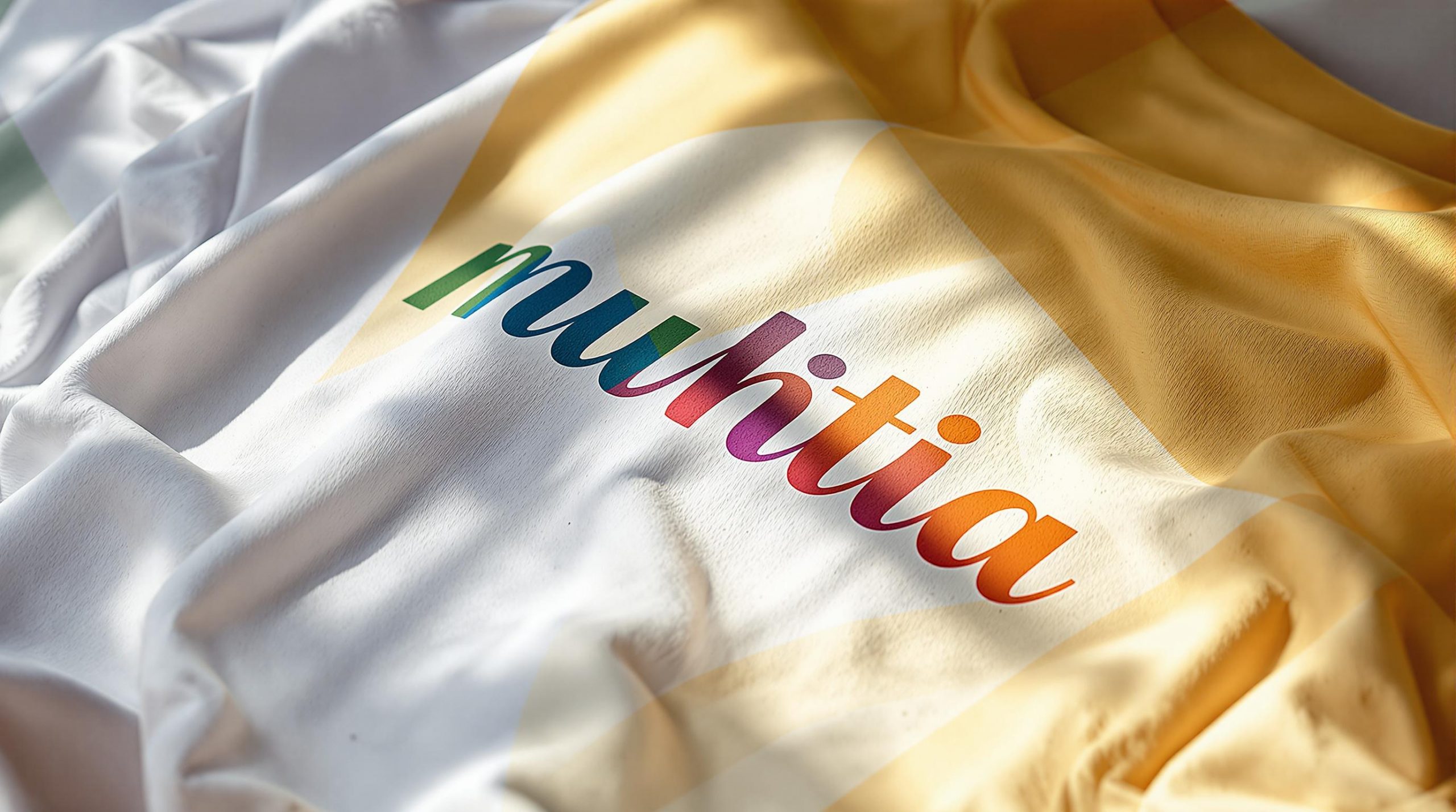
Choosing the right font for custom t-shirts can make or break your design. Fonts set the tone, convey personality, and ensure your message is easy to read. Here’s what you need to know:
- Visual Impact: Match the font style to the theme (e.g., bold for a rock band, script for weddings).
- Readability: Ensure the font is legible, even from a distance.
- Font Types:
- Serif: Classic but may lose sharpness in print.
- Sans-serif: Clean and easy to read, ideal for most designs.
- Display Fonts: Great for attention-grabbing headlines.
- Text Fonts: Best for longer, detailed text.
- Font Weight and Style: Use bold for visibility, light for subtlety, and italics sparingly.
- Testing and Adjustments: Always test font size, contrast, and placement on the actual fabric.
Quick Tips:
- Use digital tools like ooShirts to preview fonts and layouts.
- Test print a sample to check readability and design balance.
- Pair fonts wisely to create a clear hierarchy in your design.
Start with these basics to create t-shirt designs that stand out and deliver your message effectively.
Pair fonts like a pro: 8 Font Combinations for T-Shirt Design
Font Basics for T-Shirts
Understanding font basics can elevate your t-shirt designs. Let’s break down the key typography elements that influence how your message appears on fabric.
Serif and Sans-Serif Fonts
Serif fonts have small decorative strokes at the ends of their letters, while sans-serif fonts are clean and stroke-free. These differences play a big role in readability and style on t-shirts:
- Serif fonts (like Times New Roman or Georgia) give a classic, polished look. However, their intricate details can lose sharpness when printed, especially at smaller sizes.
- Sans-serif fonts (such as Arial or Helvetica) are easier to read and maintain clarity, even from a distance.
Because of their simplicity and readability, sans-serif fonts are often the go-to choice for t-shirt designs. Let’s move on to how display and text fonts can shape your design’s tone.
Display and Text Fonts
Display fonts are bold and decorative, ideal for grabbing attention, while text fonts are designed for longer, more readable content. Here’s a quick comparison:
| Font Type | Best For | Examples | Things to Keep in Mind |
|---|---|---|---|
| Display Fonts | Headlines, logos, slogans | Impact, Rockwell | Use large sizes for better visibility |
| Text Fonts | Quotes, event details | Roboto, Open Sans | Ensure legibility for extended text |
Now, let’s explore how font weight and style can add depth to your designs.
Font Weights and Styles
Font weight and style can make or break your design’s visibility and overall vibe:
- Bold fonts are perfect for highlighting key messages, creating contrast on darker fabrics, and ensuring readability from afar.
- Light fonts work well for secondary details or subtle elements, especially on lighter-colored shirts where contrast is softer.
- Italics can add flair to short phrases but should be used sparingly, as overuse can hurt readability.
Before finalizing your design, experiment with different font weights and styles using digital previews to see how they’ll look on fabric.
Picking Fonts That Fit Your Design
Choosing the right fonts for your custom t-shirt design is all about matching them to the shirt’s theme. Adjusting font style, size, and color can help you craft a design that gets your message across and connects with your audience effectively [1].
Purpose and Target Audience
Your font choice should reflect the message you want to convey. Whether you’re going for a polished, professional look or something more playful, the typography should complement the overall design [1]. Also, think about how your text works alongside any graphics you include.
Matching Fonts with Graphics
Make adjustments to text settings like size, outline, and color to enhance the visuals. Testing how your fonts interact with the graphics ensures your design looks balanced and clear, without losing its impact [1].
Font Combinations and Layout
Create a clear visual hierarchy in your design. Use a bold, eye-catching font for the main message and pair it with a complementary style for any secondary text. Keep all text elements within the printing area, and pay attention to spacing and alignment to maintain readability and a polished look [1].
sbb-itb-1cc5ba6
Making Text Easy to Read on T-Shirts
When designing t-shirts, making your text easy to read is crucial. This means paying attention to font size, contrast, and testing your design on the actual fabric to ensure it looks great in real life.
Font Sizes and Viewing Distance
Pick font sizes that are easy to read, whether someone is standing close or further away. Avoid squeezing too much text into a small space, as it can make your design look cluttered and hard to read.
Fabric Types and Colors
The type of fabric and its color can impact how your text looks. Use color combinations that create strong contrast, and consider adding outlines or tweaking font styles to make the text pop. Always test these adjustments with a printed sample to ensure they work on the chosen material.
Print Testing and Samples
Before committing to production, print a sample to check the text’s size, placement, and contrast. This step helps you fine-tune outlines, colors, or other details. If you’re designing online, tools like ooShirts (https://ooshirts.com) provide digital previews to help you see how your text will look on different t-shirt styles.
Digital Tools for Font Selection
Digital design tools have completely changed how we choose and preview fonts for custom t-shirts. They make it easier to turn your digital ideas into perfectly printed designs.
Using Online Design Tools
Online design tools simplify the process of picking and customizing fonts. For example, ooShirts’ design lab allows you to experiment with various fonts, sizes, outlines, and colors, all while ensuring your design stays within the printing area [1]. Features include:
- Real-time font previews
- Customizable text outlines
- Color combination testing
- Size adjustment options
Once you’ve set your preferences, you can use digital previews to see how the final design will look.
Digital T-Shirt Previews
Digital previews help you avoid any surprises by offering a realistic look at your design.
Key features to explore:
- Testing fonts on different shirt colors
- Viewing designs from multiple angles
- Checking text placement and scaling
- Ensuring text contrasts well with the fabric
These in-depth previews make it easier to refine your design before printing.
Letter Spacing and Alignment
After previewing your design, fine-tuning letter spacing and alignment is crucial for a polished result.
Here’s what to tweak:
- Adjust kerning for individual letter pairs and tracking for entire text blocks
- Align text vertically and horizontally
- Scale text appropriately in relation to other design elements
Once you’re satisfied, save your design and consider getting a professional review to spot any spacing or alignment issues [1].
| Design Element | Digital Tool Feature | Benefit |
|---|---|---|
| Font Selection | Font Library | Access to a variety of font styles |
| Text Placement | Position Grid | Precise control over alignment and spacing |
| Size Control | Scaling Tools | Ensures proper proportions for all sizes |
| Color Testing | Digital Preview | Shows accurate text-to-fabric contrast |
Conclusion: Font Selection Tips
Wrap up your custom t-shirt design by focusing on how your font works on the final product, getting feedback, and using the right digital tools. Platforms like ooShirts offer helpful resources for t-shirt typography [1]. Here are some practical tips to perfect your font choice:
- Test Before Printing
Order a single test shirt to see how the font actually looks. This small step can save you from costly mistakes when placing larger orders. - Seek Professional Feedback
Ask a design expert to review your t-shirt design. Their input can help you fine-tune the details before hitting print. - Leverage Design Tools
Use online tools like ooShirts’ design lab to experiment with font styles, weights, colors, spacing, alignment, and more. These adjustments can make a big difference in the final look. - Save Your Design Files
Keep your design file handy for easy edits or reorders in the future.
If you need extra help, ooShirts offers customer support every day of the week. Their team can guide you through font selection and design tweaks to ensure your message pops just the way you want [1].